What the image shows
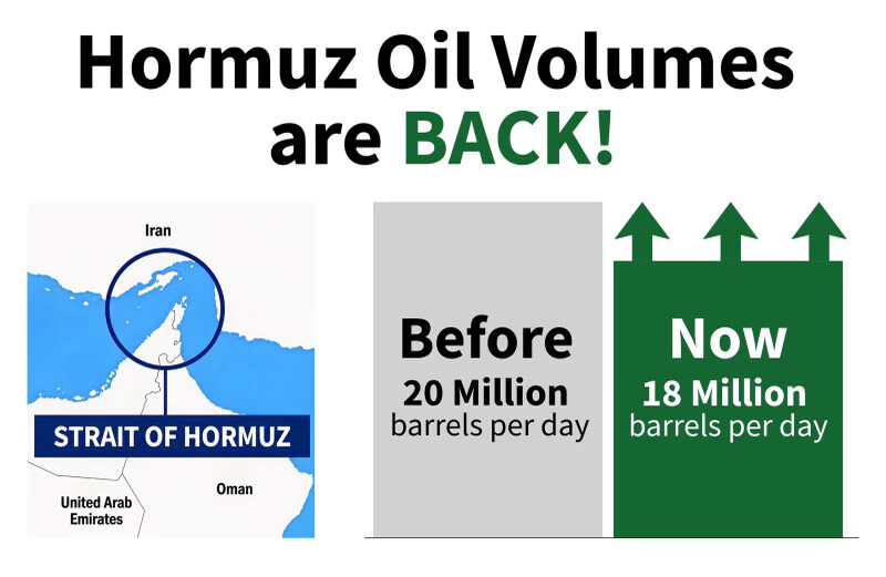
An infographic-style chart. On the left is a map showing the Strait of Hormuz, circled, located between Iran and the Arabian Peninsula (labeled Iran, United Arab Emirates, Oman), with the strait highlighted in a blue banner. On the right is a bar comparison graphic: a gray bar labeled "Before / 20 Million barrels per day" next to a green bar labeled "Now / 18 Million barrels per day" with upward arrows above the green bar. The headline at top reads "Hormuz Oil Volumes are BACK!" despite the chart showing the "Now" figure (18 million) as lower than the "Before" figure (20 million).
Text in image: Hormuz Oil Volumes are BACK! Iran STRAIT OF HORMUZ United Arab Emirates Oman Before 20 Million barrels per day Now 18 Million barrels per day
Described automatically. The words above are a machine's reading of the picture, not Trump's.