What the image shows
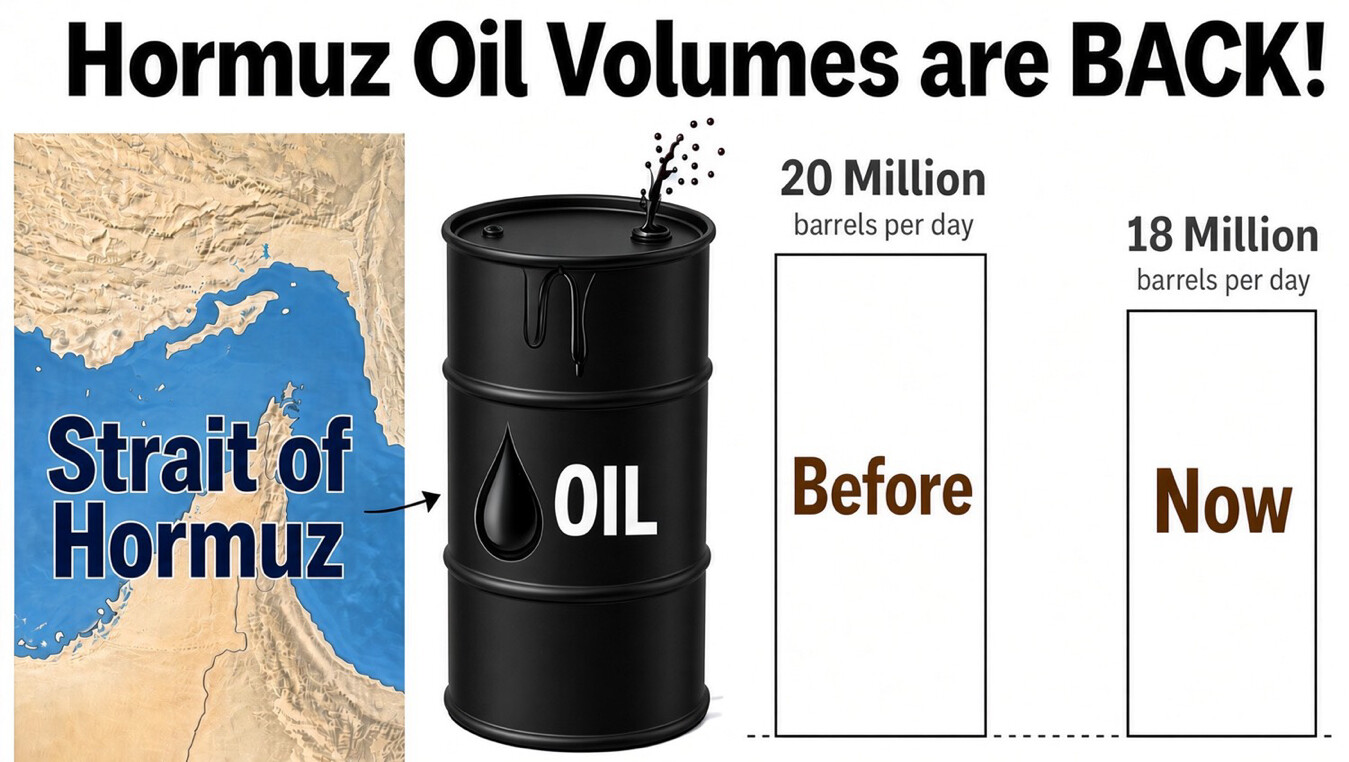
An infographic-style chart. On the left is a stylized map showing a body of water labeled "Strait of Hormuz" bordered by tan/beige landmasses, with an arrow pointing right to a black oil barrel labeled "OIL" with a dripping oil droplet icon. To the right of the barrel are two bar-chart columns, both drawn as empty outlined rectangles of nearly the same height: one labeled "20 Million barrels per day" above the word "Before," and the other labeled "18 Million barrels per day" above the word "Now." The bars are not drawn to scale relative to their labeled values (the "Now" bar showing a lower number is not noticeably shorter than the "Before" bar).
Text in image: Hormuz Oil Volumes are BACK! Strait of Hormuz OIL 20 Million barrels per day 18 Million barrels per day Before Now
Described automatically. The words above are a machine's reading of the picture, not Trump's.