What the image shows
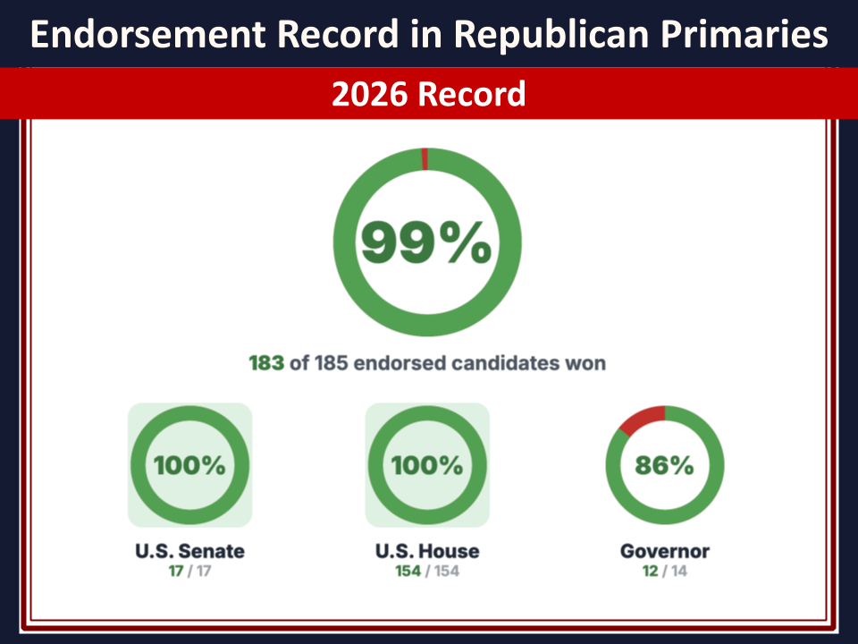
This is an infographic/chart image with a dark navy header bar and a red subheader bar, titled with statistics about political primary endorsements. Below the header is a white panel containing a large circular (donut) progress chart showing "99%" in the center, mostly green with a small red sliver, and a caption below it stating the underlying fraction. Under that are three smaller donut charts side by side, each showing a percentage in the center with a green ring (small red sliver on the third one) and a labeled category with a fraction beneath it.
Text in image: Endorsement Record in Republican Primaries 2026 Record 99% 183 of 185 endorsed candidates won 100% U.S. Senate 17 / 17 100% U.S. House 154 / 154 86% Governor 12 / 14
Described automatically. The words above are a machine's reading of the picture, not Trump's.